hung doan — Style Guide
The shared component system for every /video/ page. Built from three stylesheets:
css/tokens.css (design tokens + the sharp-corner reset), css/shell.css
(chrome, buttons, forms, pills, modals), and css/editor.css (workspace, panels, layer/job rows, timeline).
No build step — author HTML against these classes and it ships. This page itself uses only those classes.
This guide is self-contained — CSS, JS, the icon sprite and placeholder art are vendored into styleguide/, so the whole folder zips and runs anywhere with no ../ dependencies. Full-page layout references live in Reference pages.
An agent-readable version of this system lives in styleguide/skills/ — one Markdown spec per topic (start at skills/SKILL.md) so AI coding agents can load the design language directly. Each section below carries a skill: … link to its spec file.
Design principles
The core idea: this is a desktop application, not a web page. Every page wears native-app chrome so the product feels like a tool you install, not a site you visit. Seven rules carry that through:
.vshell (no page scroll) with a titlebar menu bar (File / Edit / Actions ribbon with drop-downs, .menus + .menu-drop), a statusbar at the bottom, and content organised into panels with collapsible sections (.panel-section + .panel-toggle) and tabs — exactly the affordances of a native editor (Photoshop, an NLE, a DAW). Right-click opens a .ctx-menu. Everything else here serves this feel.border-radius on all elements — square, defined edges read as "application". The only exemption is inside [data-live-stage] (real artwork canvases, where payload radii must render). Don't add radii — if you must, qualify your selector to out-specify the reset (see the scene-map brief card).--bg → --panel-3), one blue accent for primary/active, status colors reserved for meaning..future. Yellow-green + a data-stub toast — see Conventions below.Shell & chrome — the desktop frame
The native-app feel comes from the frame every page wears. The titlebar at the top of this page is live — click Go to, File, Edit or View to open a drop-down ribbon (the File/Edit/View menus are inert — there for the desktop feel), and right-click the Context-menu demo below. The pieces:
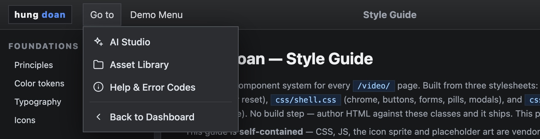
.menus → .menu-drop), opened by shell.js..vshell — full-viewport grid, grid-template-rows: 44px 1fr (titlebar / content). Add a third 26px row for a statusbar, and .with-timeline for a bottom strip. The shell never page-scrolls — content panels scroll internally, like an app window..titlebar holds: .brand (the wordmark) · .menus → .menu → .menu-drop (the File/Edit/Actions ribbon; .kbd for shortcuts, hr separators, .danger items) · .project-title (center) · .top-actions (right). Menu open/close, drop-downs, and data-modal / data-stub are wired by shell.js — no per-page JS..statusbar — the 26px footer (left message + right meta), an app-style status line..ctx-menu — right-click menu via VideoShell.contextMenu(x, y, items); see Overlays.Layout anatomy
How the desktop frame nests. The ASCII map shows the regions; the mermaid block is the same structure as a diagram you can paste into any mermaid renderer (kept as source so this bundle stays dependency-free).
.vshell.with-timeline page┌────────────────────────────────────────────────────────────────────────────────────────────┐ │ .titlebar (44px) │ │ .brand .menus (File / Actions) .project-title .top-actions │ ├──────────────────────────┬──────────────────────────────────────┬──────────────────────────┤ │ .left-panel │ .stage-area │ .right-panel │ │ tray tabs │ .viewer-frame │ .tabs │ │ > Cast │ (canvas) │ > .panel-section [v] │ │ > Frames │ │ (collapsible) │ │ │ .workspace - 3-col grid │ │ ├──────────────────────────┴──────────────────────────────────────┴──────────────────────────┤ │ .timeline-wrap - jobs strip / timeline (.with-timeline) │ ├────────────────────────────────────────────────────────────────────────────────────────────┤ │ .statusbar (26px) left message ......... right meta │ └────────────────────────────────────────────────────────────────────────────────────────────┘
graph TD
  vshell[".vshell · CSS grid"] --> titlebar[".titlebar · 44px"]
  vshell --> workspace[".workspace · 3-col"]
  vshell --> timeline[".timeline-wrap · optional"]
  vshell --> statusbar[".statusbar · 26px"]
  titlebar --> brand[".brand"]
  titlebar --> menus[".menus → .menu → .menu-drop"]
  titlebar --> ptitle[".project-title"]
  titlebar --> actions[".top-actions"]
  workspace --> left[".left-panel · tray tabs"]
  workspace --> stage[".stage-area · .viewer-frame"]
  workspace --> right[".right-panel · .tabs + .panel-section ▾"]
Color tokens
CSS custom properties on :root in tokens.css. Always reference the variable, never the hex.
Typography
Inter for UI (--font, 14px/1.4 base), monospace for IDs/timecodes/code (--mono). Readable content — documentation, front-facing/end-user copy, prose — uses the 14px base. Editor & tooling UIs drop to 12–13px to fit dense, panel-heavy workflows within the browser; that density is intentional there and shouldn't leak into readable text (this page itself follows the rule — its prose is 14px).
Icons
Lucide-adapted SVG sprite at assets/icons/icons.svg, all currentColor. Place <i data-icon="name"></i> — icons.js hydrates it on load; call VideoIcons.hydrate(root) after injecting markup. Sizes: .ic (16) · .ic-lg (20) · .ic-xl (24). Click any icon to copy its markup.
<i data-icon="play"></i>
Full-page layouts (mock)
Standalone pages assembling the components into the real app layouts — open each to study structure, spacing and the responsive grids. All self-contained in this folder.
Guided Tour — onboarding overlay
A drop-in walkthrough layer for any page. Two self-contained scripts (they inject their own CSS, no dependencies): a notice modal that frames the page (great for demos/onboarding, with a CTA), and a guide layer that turns tagged elements into glowing, click-to-explain hotspots plus a step-through tour. Built for the public /demo/ walkthroughs; vendored here as a reusable pattern. See it live in the Guided Tour reference page (the queue layout with the layer applied).
Usage — add the two scripts, then tag any elements:
<script src="../js/demo-notice.js" data-hint="Click a region, or take the tour."></script>
<script src="../js/demo-guide.js"></script>

<section class="queue-list"
         data-guide="Jobs :: Filter by status and select a job to inspect its log.">
  …
</section>
box-shadow (no layout shift, corners stay sharp). Self-contained — copy both files + tag elements and it runs anywhere.Buttons
Bare <button> and .btn (for <a>) share the graphite base. Variants layer on intent.
.btn-primary blue (the workflow CTA) · .btn-ghost transparent · .btn-danger red outline. For an AI-assist CTA the scene-map adds a page-local green .btn-ai — promote it to shell.css if a second page needs it.Form controls
Inset background, --line border, full-width by default. label is a block element above its control.
.two-col for paired fields · .control-group spaces stacked fields · .selectish styles a button as a faux-select.File upload
One upload pattern, two variants. All share the same three intake routes: click → file picker (a hidden <input type="file">), drag-and-drop (a .dragover highlight on hover), and — where a library exists — pick from existing assets. Live in the Mock Form (drop a file on a slot).

The reference/frame slot's middle button opens a shared image picker modal — do not build a new one. Call openImagePicker(title, onPick) from js/library/picker.js; it returns the chosen image via callback as { url, thumb, title }. Used by the AI Studio frames, storyboard editor & scene map, sequences, and cast views.
Reference image
openImagePicker (library/picker.js — needs the #picker-modal DOM in the page) is the general slot picker; openGallery (editorial/js/gallery.js — self-injects its DOM) is the editorial browser. For a new page, copy the #picker-modal block from studio/index.html and import openImagePicker.<input type="file"> the buttons trigger; dragover/drop handlers toggle .dragover and read e.dataTransfer.files; uploaded files post to the staged-frames API and the returned URL fills the slot. Real uses: storyboard editor & scene-map reference slots, the AI Studio Advanced frames.Status pills
.pill.<state> — small caps-weight status chips with a semantic color per state.
STATUS_PILL: scripting/compiling→encoding, ready→queued, running→running, paused→draft, completed→complete, published→published, failed→failed. Animate an active pill by adding the job-pulse keyframe (1.6s).Badges & chips
.badge — neutral metadata. .chip — selectable filter (toggle .active); group in a .chip-row.
Tabs
Two flavors. .tabs — equal-width segmented control (right panels). .tray-tabs-cloud + .tray-tab — wrapping pill cloud (left panels); active is .is-active.
Panels & layout
.panel is the base surface. .panel-section + .panel-toggle make a collapsible block (toggle .is-collapsed on the section). The editor workspace is a 3-column grid: .workspace → .left-panel / .stage-area / .right-panel.
Click the header to collapse. Body hides when the parent has .is-collapsed.
.vshell grid (44px titlebar / content / optional 26px statusbar); add .with-timeline for a bottom strip. Gallery/scroll pages use .page + .page-head.Cards & galleries
.card-grid auto-fills .cards (240px min). A card has a .thumb (16:9, or .tall 9:16) and a .meta block. Selection: .selected/.active.
.grid-empty (centered, full-width). Picker/gallery cards reuse .lib-card (defined page-local where the picker is mounted).Media asset cards
The library pattern: a grid of media cards, each opening a preview modal on click. Cards carry their data on data-* attributes; the click handler populates and opens #preview-modal. (Thumbnails here are self-contained placeholder SVGs.)
One modal (#preview-modal) serves every tab via library/preview.js — openPreview(asset) for catalog/upload rows, openStockPreview(item, opts) for Pexels results. It picks the element by kind — <img> / <video controls autoplay muted loop> / <audio controls> — and the footer carries contextual actions: Copy Path, Download (video) or Raw File (other), and conditionally Add to Live Assets / Delete. It stops playback on close (a MutationObserver pauses any video,audio when .open is removed) so audio doesn't keep playing behind the gallery.
When the gallery holds generated video work, a coloured outline + glow on each .lib-card says what the asset is at a glance — finished render vs. storyboard cut vs. single scene vs. still. The same four colours are the legend, and the legend is the filter: each .cat-chip carries its colour .dot and toggles the view. Live in Studio → Generate (library/ai.js, categoryOf()); classification reads asset.metadata client-side. A duration rides on each card. Use it anywhere the Asset Library browser shows mixed generated media.
masterCut || narrated || captionedfinalCut && storyboardIdmetadata.videobox-shadow: 0 0 0 1.5px ring, 0 0 16px -5px glow (no layout shift)metadata.duration (scenes) or probed metadata.durationSec (cuts, set by the thumbnail worker)Tables
Plain <table> picks up borders/padding from editor.css (bottom-border rows, dim th). .mini badges flag per-row state.
| Job | Kind | Status | Asset |
|---|---|---|---|
| #84 | stitch | complete | 4621 |
| #83 | video_gen | running | — |
| #82 | image_gen | failed | — |
List & layer rows
.layer-row — selectable row with hover + .is-active (layers panel, scene lists). Used with a thumb + main column + trailing pill.
Jobs & progress
Job rows use the queue .job skin. In-flight work gets the live-progress pattern: a pulsating info line + an indeterminate creep bar (providers give no real %, so the bar creeps elapsed / expected and caps at ~96%). A 1s ticker re-reads data-since/data-expected between polls.
Timeline — tracks & lanes
The timeline is its own area of the system and will grow — tracks & lanes here, with clips, transitions, captions, the ruler & playhead to follow. It stacks labeled lanes, one per track type, each with its own color & graphic so a glance reads the track: video/scenes = blue filmstrip, voiceover = green waveform, music = purple waveform, captions/text = purple chips. Audio never uses the filmstrip — it draws a waveform.
.audioclip is purple (music) — add .voice for the green voiceover variant. The .waveform is a flex row of <i> bars whose heights are the audio peaks (filled by JS here; real peaks come from the backend per asset).Asset tray
The left panel used in both the slideshow and reels editors. Top-level .tray-bar tabs group content by kind. Each tab has its own search (scoped) and optional category filter pills (sub-type chips) below it. The .more button is a visual placeholder — no action.
Gallery browser TBD
A reusable, drop-in asset picker — open it from anywhere (category cover, category shared assets, compose, future surfaces) to browse, filter, preview, and pick an image asset. Unlike the editor's left-panel asset tray, this is a modal overlay component that self-injects its own DOM + styles and returns the chosen asset via a callback.
openImagePicker (from
js/library/picker.js, documented under File upload).
That one needs the #picker-modal DOM in the page; this editorial
openGallery self-injects its own. Both return the pick via callback.
/video/library/ as the canonical browser. Full architecture:
architecture/MEDIA-gallery.md.
Audio inspector
Selecting an audio clip swaps the inspector's geometry/effect rows for a single Volume control — audio is non-visual, so X/Y/size and entrance effects don't apply. The slider runs 0–200 % (100 % = unity), with a live dB readout (20·log₁₀(v/100)). Preview caps at 100 % — the worker's ffmpeg volume filter applies true gain on render.
X/Y · Width/Height · Effect · FX duration. Kept: Label, clip Start/Dur (trim), Delete. Volume lives on the node (props.volume, default 100).Modals
.modal-backdrop (toggle .open) holds a .modal with .modal-head (eyebrow + title + .modal-close), a scrolling body, and .modal-foot. shell.js wires data-modal="#id" to open and data-modal-close/backdrop to close. Sits at z-50 — layer above app overlays with a higher local z-index (e.g. the picker on the scene map). Reserve modals for dialogs/pickers, never logs.
Modal galleries & sub-views
Pickers (effects, assets) are modals whose body is a .fx-grid of .fx-cards, grouped into collapsible .fx-section-title categories. Choosing a card that has further options swaps the modal to a sub-view (step 2) — a back button (.fx-back) appears in the head and the title changes, no second modal. This is the slideshow effects picker: open it, collapse a category, then pick Hand Draw to reveal the hand chooser.
.fx-section-title → .is-collapsed hides the grid below it) · effect cards .fx-card with .fx-preview + label + desc (+ .is-active) · two-step flow with a head back button. From js/slideshow-editor.js.Context menu
Right-click menus reinforce the desktop-app feel. Open one with VideoShell.contextMenu(x, y, items) (from shell.js) — each item is { label, icon?, danger?, action }, rendered with the .ctx-menu styling (auto-positioned, closes on outside-click / Esc). danger: true tints an item red.
contextmenu listener to specific surfaceselement.addEventListener("contextmenu", (e) => {
const row = e.target.closest("[data-id]"); // a surface that has a menu
if (!row) return; // otherwise: native menu
e.preventDefault();
VideoShell.contextMenu(e.clientX, e.clientY, [
{ label: "Copy", icon: "save", action: () => copy(row.dataset.id) },
{ label: "Duplicate", icon: "layers", action: () => duplicate(row.dataset.id) },
{ label: "Expand", icon: "zoom-in", action: () => expand(row.dataset.id) },
{ label: "Delete", icon: "trash", danger: true, action: () => remove(row.dataset.id) },
]);
});
preventDefault() only on surfaces you handle, so the browser's native menu still works elsewhere. Used in the Typography workbench (right-click a stage node or a .layer-row).Stage & preview
A plain media preview uses .viewer-frame (16:9; .tall 9:16, .square 1:1). A live render canvas uses .reels-stage-frame with the data-live-stage attribute (the one place radii are allowed).
Conventions
Future / stub controls. Anything not yet wired gets .future (yellow-green) + data-stub="message"; shell.js shows a toast on click. Remove the class when wired.
Error banners. Provider/pipeline failures parse through friendlyError() (shared.js) — it pulls the message out of raw HTTP/JSON, adds an actionable hint, and links to a matching /video/help/#anchor section from help/errors.json. Render loud, above the stage.
Code / payload view. Raw JSON or prompts render in a mono <pre> on the inset surface (green-on-dark), with a Copy affordance — never a modal.
{
  "logline": "Three kids on bikes blur past a sleeping relic…",
  "scenes": [ { "idx": 0, "shot": "wide establishing" } ]
}